
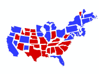
2012 US Presidential election results by State A brief summary of the item is not available. Add a brief summary about the item.
![]() Web Map
by
Web Map
by
Item created: Aug 1, 2014 Item updated: Aug 1, 2014 View count: 8,198
Description
Map type
The Non Contiguous Cartogram is a technique for representing data for areas that uses re-sized geographical shapes to depict a quantifiable difference between values of data in the unit areas. While shape is preserved, topology and object centroids are not and the resulting map is an abstract representation of the spatial pattern of the phenomena being mapped.
Similar to the Dorling Cartogram, the symbols are repositioned to overcome the problems of overlaps caused by some non-contiguous cartogram techniques. On disadvantage of this technique compared to a Dorling cartogram is the irregularity of the shapes makes relative comparisons less easily assessed.
A cartogram can be a powerful approach to mapping population data since it provides a strong visual and does not require data to be normalised. The drawback is that the distortions can be a hurdle for some in their understanding. In this example of the 2012 Presidential election, the map is designed to show the size of the overall vote at State level with the addition of colour to represent the winning candidate.
Data
For the theme being mapped, the data should be numerical (quantitative) and represent differences between features on an interval or ratio scale of measurement. The map type normally requires data to be absolute, as totals, but it can be used with relative measures such as ratios of percentages. Here, the vote totals are augmented by symbols that define a second categorical characteristic of the data, namely ‘Republican’ or ‘Democrat’.
Symbols
Symbols are the geographical shapes themselves to preserve recognition. Variation in the size of the symbol, used as an ordering visual variable visually represents different magnitudes. Symbols should be scaled so that the smallest are visible and the largest do not overly smother the map with the largest symbols representing the largest magnitudes.
In this example, the categorical data are also symbolized with red and blue hues to match the political affiliations.
Marginalia
Since the symbols are irregular it’s impossible to create a legend to represent scaling but published as a web map allows popups to reveal actual values. The overall pattern is easily seen without a legend in this context. The categorical data is represented in the legend to differentiate the two political parties and the map should be finished with a succinct title, source details and relevant credits. Popups give readers access to data values for a more detailed exploration of each area.
Map Use
When viewed, the map reader should be able to efficiently see the relative differences between symbol sizes and be able to determine a pattern across the map. When size is used as an ordering visual variable we are ascribing more importance to the larger magnitudes of data. We visually interpret the symbols as differently sized so we perceive larger symbols as meaning ‘more’. The multiscale characteristic of a web map means we can design the map to reveal more detail at larger scales (e.g. labels) as the reader zooms in. This not only increases the interest in your map but enables you to take advantage of the different scales
An in-depth description of the item is not available.
Tables
Basemap
Project Contents:
Solution Contents
Contents
Layers
Screenshots
Terms of Use
No special restrictions or limitations on using the item's content have been provided.
Details
Dashboard views: Desktop
Source:
Creating data in:
Published as:
Other Views:
Dependent items in the recycle bin
Applicable: 2d
Size: 3.748 KB
ID: 94f2fa58883f406489ff275cba271d70
Image Count: 0
Image Properties
Layer Drawing
Using tiles from a cache
Dynamically from data
Share
Owner
Folder
Categories
This item has not been categorized.
Tags
Credits (Attribution)
No acknowledgements.Kenneth Field
Comments (0)